The aixplain brand, in one place.
The logo, colors, type and imagery that make aixplain recognizable. Engineered, not decorated.
Brand Identity Guide, alpha, August 2026
The iron butterfly and the wordmark.
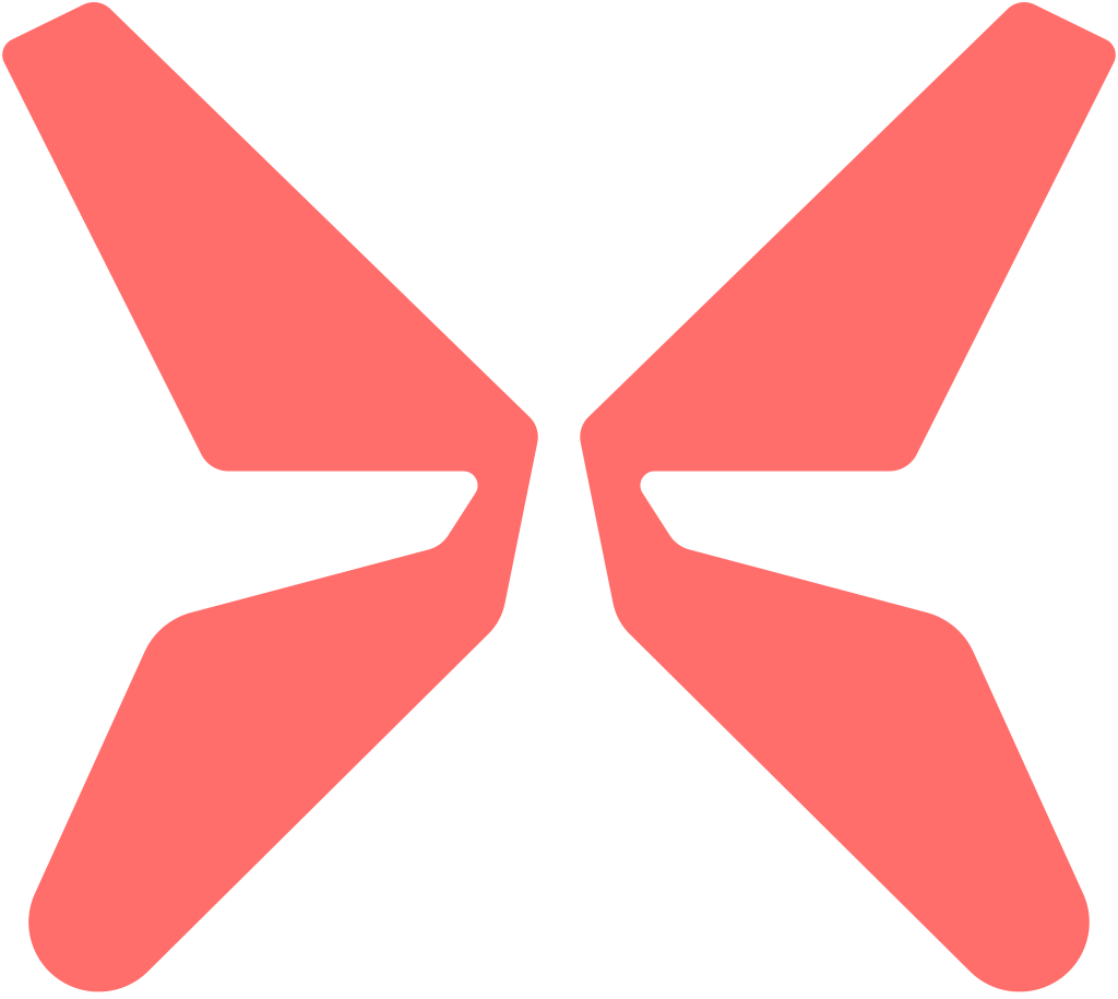
The logo is an X-shape we call the iron butterfly, paired with the aixplain wordmark. Use the butterfly alone only where the full logo does not fit: mobile, favicon, app icon.



The logomark
The iron butterfly alludes to the X of aixplain. Its top-down asymmetric, sci-fi shape reads simply as an X once you zoom out.


One system, designed for two contexts.
A small set of core hues, each tuned for light and for dark surfaces rather than inverted. Coral leads: it holds one value in both themes and marks primary actions and anywhere the brand needs to speak first.
Primary
- BlackHEX 101010RGB 16, 16, 16
- WhiteHEX F8F8F8RGB 248, 248, 248
- CoralHEX FE6B6FRGB 254, 107, 111
Secondary
On light backgrounds
- AmberHEX FFB71FRGB 255, 183, 31
- BlueHEX 0F8FD9RGB 15, 143, 217
On dark backgrounds
- Amber SecondaryHEX EBC577RGB 235, 197, 119
- Blue SecondaryHEX 1977AERGB 25, 119, 174
Color combinations
A color system is a set of relationships: which pairings carry authority, which stay in the background, and which are saved for moments that need to earn attention.
- Coral on black and white
- Amber on black and white
- Black on white
- White on black
- White and black on coral
- Blue on black and white
- White and black on blue
- White and black on amber
Three typefaces, one job each.
Headlines
Plus Jakarta Sans
For the moments where the brand makes a statement rather than explaining one. Its geometric warmth gives headlines presence and point of view.
Get Plus Jakarta Sans(opens in a new tab)The best infrastructure disappears. What remains is you, doing the work that matters.
Paragraphs
Inter
The workhorse for paragraphs, UI copy and long reading. Where Plus Jakarta Sans declares, Inter explains: neutral, legible at small sizes, built to disappear.
Get Inter(opens in a new tab)Inter is crafted for a wide range of uses, from detailed user interfaces to marketing and signage.
Accents
JetBrains Mono
Where the brand needs to sound precise: labels, data and the small structural cues that make a system feel engineered. Mostly in upper case.
Get JetBrains Mono(opens in a new tab)Upper case register
Patterns and backgrounds.
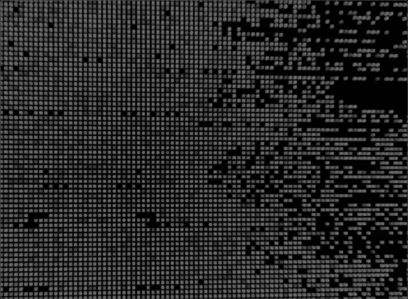
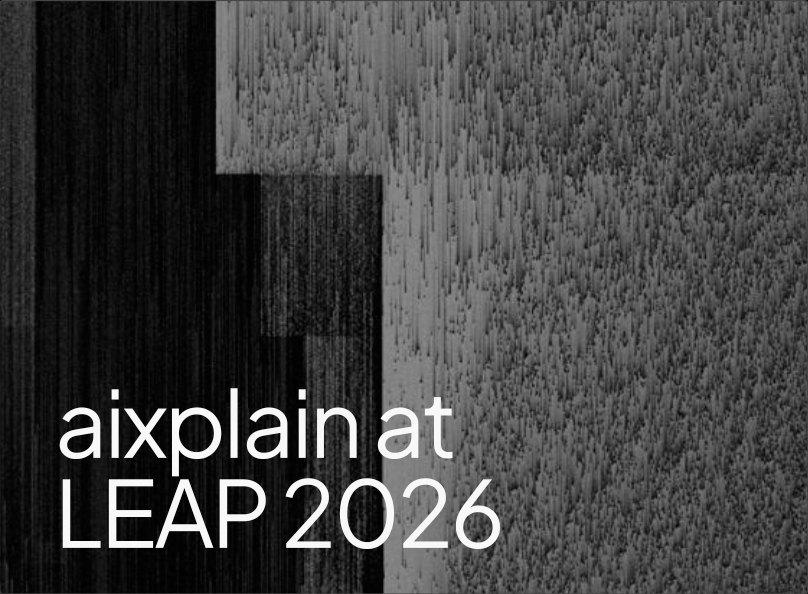
Human-made artifacts, like brush strokes and paint textures, crossed with glitch patterns, ASCII arrays and pixel sorting: the intersection of human and machine.



Reality, through the system.
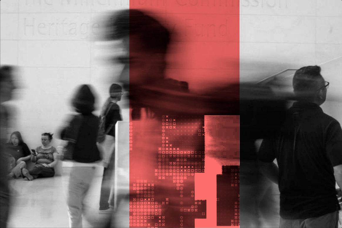
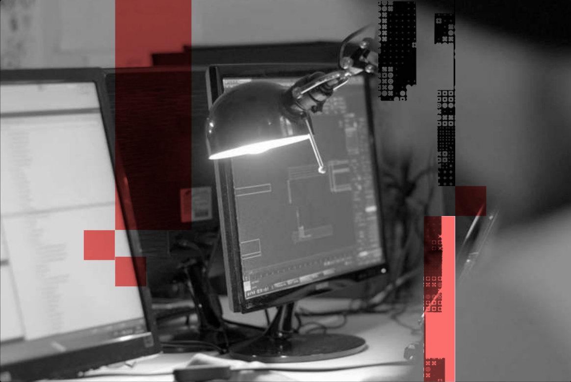
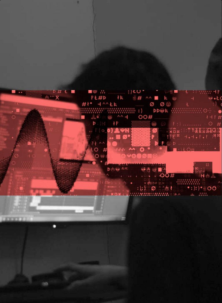
Our photo treatment makes one idea visible: beneath the surface of anything is structure. We cut a window into the photograph and show what is underneath.
- 01
Every photo is black and white, so the one accent stands out against it.
- 02
A coral geometric shape sits over the photo in Multiply blending mode.
- 03
Inside the shape, the photo gives way to ASCII characters and glitch artifacts: a visible seam between the photographic and the computational.
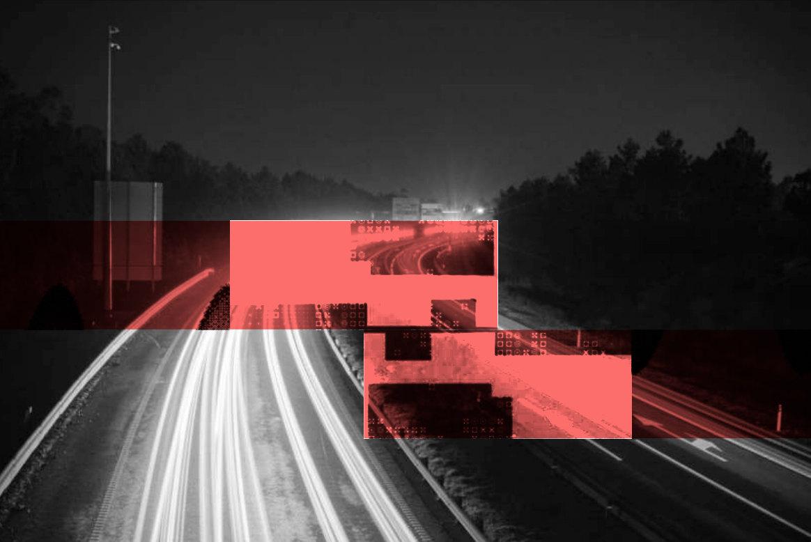
Any image can be turned into a brand beacon in a minute.
Illustrations.
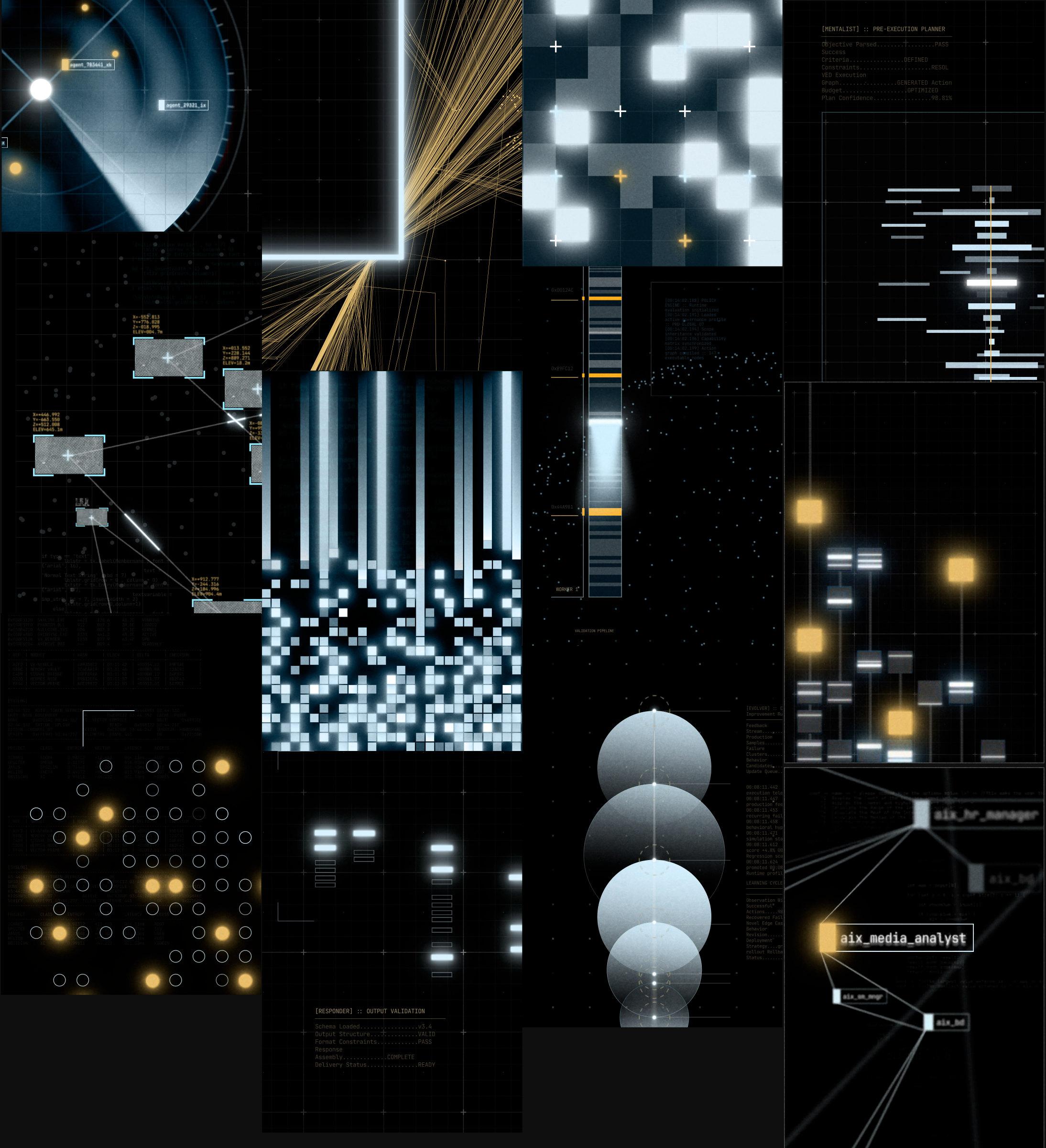
Abstract metaphors for the product underneath, in a rich, sci-fi style. They contrast with the stark minimalism of the core identity and give the eye a place to land.